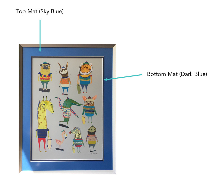
If you're new to the world of custom framing, you may not have come across double matting before. It's a pretty simple technique, done by layering one mat on top of another so that the bottom mat acts as a decorative border around your framed artwork. It's an easy, affordable and a more unique way to add a little something extra to the finished product. Here, we offer some quick advice and break down the different ways to make accent mats work with your project and vice versa.

Option 1: The Single Accent Mat
When you're looking for a pop of color to make your artwork stand out even more, look no further than the classic accent mat. It can be any color from our catalogue with hundreds of shades, but we know picking one out is an overwhelming process. So one conventional and surefire way to go is to match the bottom mat (the thinner mat width) to a color that's already featured in your artwork, print, poster or photo.
We recommend a minimum 1/4" wide bottom mat which may seem like a small addition, but can actually be a big help when it comes to tying everything together visually and drawing the eye to special details in your framed art.
Image source: The Punisher print by Declan Shalvey from Mondo. Star Wars prints by Matt Ferguson
Option 2: Color-on-Color Combos
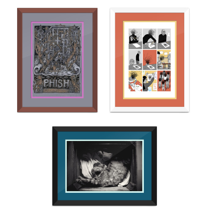
If you want to take matting a step further, you can skip the regular white or black top mat altogether and go for two colors that complement whatever you're framing. This technique looks especially great with black and white prints/photos, or really anything that might be craving some extra color. If you're framing a diploma or something sports-related like ticket stubs, try choosing your school or team colors for an even more personalized touch.

Image Source: [Clockwise] Bottleneck Gallery, Unsplash. Artists: David Welker, Asaf Hanuka, Gaelle Marcel
If you're nervous about the top and bottom mat colors clashing, try pairing a thinner, brightly-colored mat with a wider, neutral-colored mat. Neutral tones, such as shades of white, black, navy or gray, tend to match well with almost any other color.
If you're still unsure of which colors to choose, you can always enlist the help of an online resource: Upload a picture of whatever you're framing onto Pictaculous and the website will recommend a range of complementary colors. You can also browse through the variety of color palettes and combos Color Hunt recommends to help inspire or reassure you.
Option 3: Ultra-Custom with Stunning Colors and Textures
If you're in the market for something really different, we've got you covered. Beyond just mixing and matching colors, we also have mats with unique finishes, like jewel-toned suede, bright foil metallics, and even textures inspired by the ball used in your favorite sport. We recommend saving this next level matting for real stand out pieces, because they're sure to make a statement.
Here are just a few of the many wild styles of mat we carry:

If you are interested in taking your custom frame up a notch with double matting or if you're struggling to choose the right frame color, we're here to help! Just chat in or email hello@levelframes.com to get started and we'll walk it through with you.
And because we are serious about using only the best materials, all Level mats are conservation grade in quality, which means they're acid-free and will keep your artwork safe and pristine over time.


